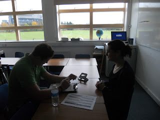
I think by doing the preliminary task we learnt alot about different camera shots/angles. For example one of the main shots we learnt about when doing the preliminary task was Match-On-Action. This is where you film someone walking through a door for example by filming them walking up to the door from behind and then filming them coming through the door from inside the room. This creates the effects of seeing someone walk through the door very smoothly and we used it both when my character was in the park and in the courtyard.
Another shot we learnt about and used in the preliminary task was the 180 degree rule. This is where your filming two or more people having a conversation by recording the conversation from an Over the Shoulder shot of one of the people and then recording the conversation again with an Over the Shoulder shot from the other person. After it's recorded you have to edit it by taking out parts of the conversation where you can't see the person who's talkings face. This makes it look like the camera is flicking between the two people who are conversing.
Wednesday, 15 December 2010
Friday, 10 December 2010
Evaluation part 6
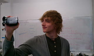 We have taken pictures of what equipment we used for our media product. These pictures show us holding the camera we used and the tripod we used for the filming.
On the macbook we used Final Cut Express, Adobe After Effects and Photoshop.
With the camera we filmed all of our footage and with the tripod we held the camera still on the majority of our shots.
Wednesday, 8 December 2010
Evaluation part 5
For part 5 of our Evaluation we had to add speech bubbles to our video on youtube containing information about why we did things in a particular way. Below is a link to part 5 of the Evaluation.
http://www.youtube.com/watch?v=XR29U3R9DBY
http://www.youtube.com/watch?v=XR29U3R9DBY
Tuesday, 7 December 2010
Evaluation part 3
For part 3 of the evaluation we had to do a directors commentary of our media product. In the commentary we had to explain what the job of a Producer(s) was, Distributer, where we got the money from and why we chose the companies we went with.
The job of the Producers is to manage the film, make sure right actors are hired for their parts, make sure the right locations were hired for the film and to make sure that the finances for the film are under control. Essentially the Producers are the ones that control everything that happens behind the film.
The job of the distributers is to sell the film to cinemas such as Cineworld, Picture House, Vue and others. If these companies agree to buy the rights to show the film then they advertise the film in their cinemas and show it in their cinemas around the country.
We said for the money to pay for the film that we got it privately. This is because the majority of our film was done on a computer using special effects. For this we didn't need a huge budget which is another reason why we got our money privately.
Here is a link to our Directors commentary..
http://www.youtube.com/watch?v=XR29U3R9DBY
Final Video
We have finally finished our video and this is what it turned out like.
The Reptile - Scott and Christian from cmdiploma on Vimeo.
The Reptile - Scott and Christian from cmdiploma on Vimeo.
EVALUATION PART 4
For Evaluation part 4 we created this mind map, drew this character and did a questionare to find out who the kind of person is who would watch our film. This is what we came up with..
Above is a picture of the kind of person who would enjoy our movie and a mind map of the kind of things that person enjoys. Our person would be the kind of guy who enjoys horror/action movies and is fairly mainstream. He is the kind of guy who would watch Sci-Fi television such as Dr. Who and Heroes. I think this is the kind of person that would enjoy our movie because it has a monster in it as the main villain and builds up quite a lot of suspense because its a horror film which is the kind of film our character would enjoy.
This person would enjoy our film because they want instant thrills, action and danger in their horror, rather than anything particularly psychological or with a slow build up. If you look at their taste in video games they like more action based survival horrors like Resident Evil rather than darker, creepy experiences such as Forbidden Siren or Silent Hill. With this in mind our opening has a significant period of suspense that ends with it sudden sharp shock - the death of what until now was the lead character.
This is much like films such as Jaws and Scream - both films that are high on action as well as suspense.
The idea of being hunted by a monster is introduced earlier on with eye effect throughout the credits. It shows the person walking in an oval/ the shape of a snakes eye.
Monday, 6 December 2010
Evaluation part 2
With my character we didn't have any lines for him to speak so any representations of any particular social group were done through the characters body language. The social group it represents is young teenage boys who are generally stereotyped to be grumpy and in a mood. This is why the character is always walking round with his hands in his pocket and doesn't smile, he always has an unhappy look about him.
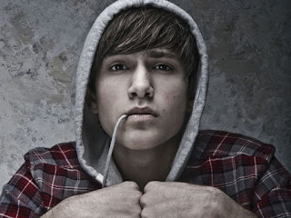 This character is quite similar to Freddie out of skins because Freddie is often in quite a bad mood and shouting at other people out of anger. He isn't a very cheerful character.
 This character is quite similar to Freddie out of skins because Freddie is often in quite a bad mood and shouting at other people out of anger. He isn't a very cheerful character.
Sunday, 5 December 2010
Evaluation part 1
For our film opening we have 9 key frames that show what happens within the first two minutes.
Our opening builds up suspense by having the majority of camera angles as point of view shots. This make the audience feel suspense because they can easily relate to what’s happening on the screen because of the angle of the camera. The music also helps build up suspense because it is quite dark and in a minor key which makes it feel quite eerie.
Throughout our film opening there is quite a menacing tone in the music which has a dark and scary feel to it making the audience wonder what’s going to happen next. The music we used is classical like it is in a lot of other horror films.
There is a threat of a monster when we see Scott in the mask and he screams at the other character who soon becomes a victim of the monsters. The monster is the killer and kills the first character that the audience are introduced to.
The victim in our film opening is the first character that the audience are introduced to. This shows that it is a horror film and not any other genre because in most other genres the audience builds up a relationship with the first character they are introduced to. Another horror film where the first character that the audience see is killed is in Scream where the girl is killed but is also the first person we see as the audience.
For the font in our credits we used a big bold font like in the film Anaconda. The reason we did our credits similar to the ones that are in Anaconda is because our film is similar to Anaconda in that they are both films about snakes. When our credits present Warner Bros. the credit comes in moving like a snake which shows the audience what the film is going to be about. The reason the font is green is because it is the same colour as the skin of a snake or a reptile which is usually a shade of green.
Friday, 3 December 2010
Re-Edit
We have had to re-edit our opening credits to make it look much more realistic. Scott is doing a lot of work on Adobe After Effects to try and make the credits look effective. We've made it look as if there is a snake watching me at all times. When I receive a text message from Scott saying "Come to the Art Block" instead of the audience seeing the message it is read out to the audience so they can hear it. As the snake is looking at me it occasionally goes fuzzy to give the effect that the camera is from the snakes point of view.
Tuesday, 30 November 2010
Mask
Friday, 26 November 2010
Final Storyboard
Our final storyboard was scanned in and we have 12 images to show what it looks like, it is similar to the previous key frames except this is more detailed. This is what some parts of the storyboard looked like.
Wednesday, 24 November 2010
Animatic
Me and Scott did an animatic of our 9 key frames. We used Adobe after effects to make it look professional. Scott was patient with me as he taught me how to use After Effects but I soon picked it up. Alot of it is about putting key frames in the right place and the effects we used include scaling, position and motion blur.
http://www.vimeo.com/17149886
Above is a link to what the animatic turned out like.
Tuesday, 23 November 2010
Rough Cut Feedback
We presented our rough cut video to our colleagues and were able to get some feedback which will take into consideration.
- “The video needs to be me ‘Reptileish’
We received positive feedback for the clean editing and special effects we used in the video however, the footage that we had wasn’t very symbolic of the film we were trying to replicate. It was suggested that we need to incorporate more reptile symbolism or somehow suggest (other than the use of the film title) that the film is about a reptile. A popular suggestion was to stylize the credits for example, we could give the credits a scaly green texture or have them animate to move like a snake across the screen. This is something we will explore more in-depth further down the production process.
- “How will the scenes be lit, what time of day will the film take place?”
Our test footage was done outside during the day and we plan to film the final piece during the day. This question was asked because in the original film the opening sequence was very dark and gloomy and ours seemed to be very bright. We plan for the second half of the sequence to be filmed in-doors and we plan to make that sequence darker and more eery in preparation for the reptile attack.
- “The attack scene should be very dramatic”
It was noted that our sequence implied that there would be a slow build up of tension - this is true. We were recommended by the teacher if a slow build up was what were aiming for then we would need to make the attack scene as dramatic as possible to justify for the build up.
- “How will you portray the point of view of the snake?”
In the second half of the opening sequence when the main character is looking around the house for his friend, we are going to have several low-angeled chanted shots looking up and watching him. This will obviously be the point of view of the snake. When it comes to the attack scene, we are going to have the camera on the floor looking around a corner up at the main character. We will move the camera to the character as if the snake is pouncing towards his neck.
- “You need to consider how you will be filming the phone in the sequence”
We showed a brief shot the character’s phone. We were planning that the character would receive a text from his friend telling to go to his house (we also planned that previous texts in the conversation would be credits for the film). However the text on the phone screen was quite difficult to read in the sunlight. It was suggested that we look for another phone to use that would be easier to read on camera. Another solution we could try is having the character walk into a darker area and placing the phone down on a surface to read it (as opposed to filming the phone in the character’s hand).
10 Key Frames
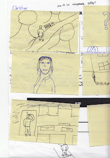
When we first started the project we had to do some key frames which showed the important parts of our scene. In order ours was of a person walking through the park, being suspicious because they think someones behind them, getting a text from their friend saying "Come to My house", being curious about the text and wondering what they want, Going to the friends house, looking for them inside the house, going into the kitchen and looking round, standing in the doorway of the kitchen turning round and screaming as they get bitten by the reptile.
Friday, 19 November 2010
Filming
Me and Scott started some filming today for our remake of The Reptile. we filmed the opening where I was to walk through a park and receive a text message saying "Meet me at mine..". It looked like this.
We still have to work out how we're going to do the credits but some of them are going to be shown during the opening sequence. Any more that we can't fit in will be shown after the sequence. We are hopefully going to sort out some after effects to use also which should be good.
Thursday, 11 November 2010
Credits List - Title Sequence
1. A Warner Bros. Production presents
2. A Universal Film
3. (Cast 1) Ray Liotta
4. (Cast 2) Joaquin Phoenix
5. (Cast 3) Sarah Michelle Gellar
6. Costume Design by Ngila Dickson
7. Art Direction by Kim Sinclair
8. Production Design by James Peter Blackmon
9. Casting by Gail Stevens
10. Film Editing by Richard. A. Harris
11. Cinematography by Danny Cohen
12. Original Music by Christian Jones
13. Produced by Barry Sonnenfeld
14. Directed by Ivan Reitman
15. (Main Title) The Reptile
Wednesday, 10 November 2010
Reptile Moodboard
We have done a moodboard for our remake of "The Reptile". The images I chose to put on there all relate to the film in different ways. The Coffin and the grim reaper relate to the film because throiughout the film there is alot of death. The snake is on there for obvious reasons that the monster is a snake. The picture of the yellow field and the trees relates to the setting of the film. It is set in the Cornish countryside. The old medicine relates to two of the main charaters, Dr. Harry Spalding and Dr. Franklyn who are both medical doctors. The woman biting her knee relates to the monster because that's how he kills its prey, by biting them on the neck.
Monday, 8 November 2010
The Reptile Synopsis
The film "The Reptile" is by Hammer film productions that myself and Scott are making a remake of.
The film takes place in Cornwall where supposedly many of the locals are dying from "The Black Death". One of the main characters Dr. Harry Spalding and his wife arrive in a local village and stay at a cottage that Dr.Spalding inherited. They get woken up one night by a character known as "Mad Peter". Dr.Spalding had already met mad Peter when he arrived in the village. When they get woken up by Mad Peter he's got green skin and dies. They alert the local doctor but he doesn't do anything about it. In time Dr.Spaldinng finds out that the local doctor is part of the "Snake Cult" which just want to make the world suffer.
The film takes place in Cornwall where supposedly many of the locals are dying from "The Black Death". One of the main characters Dr. Harry Spalding and his wife arrive in a local village and stay at a cottage that Dr.Spalding inherited. They get woken up one night by a character known as "Mad Peter". Dr.Spalding had already met mad Peter when he arrived in the village. When they get woken up by Mad Peter he's got green skin and dies. They alert the local doctor but he doesn't do anything about it. In time Dr.Spaldinng finds out that the local doctor is part of the "Snake Cult" which just want to make the world suffer.
Friday, 5 November 2010
The History of Hammer Horror Films
Horror films have changed over the years depending on what scares people at the time. For example, global warming, hooded youth etc. In the 1950's and 60's people were frightened by monsters like the monster in Frankenstein and Count Dracula.
www.backfromthedead.posterous.com
Hammer Horror films were famous for making horror films in the 50's, 60's, 70's such as The Curse of Frankenstein (Peter Cushing as shown in the picture to the right as Frankenstein) and Dracula (Christopher Lee as Dracula as shown on the right). They also made Sci-Fi, Thrillers, Film Noir and Comedies. Hammer was established in 1934 and was partner with Warner Bros. William Hinds formed Hammer Productions. Hammer made most of it's money through distribution of it's films. Some of Hammer's early successes were The Curse of Frankenstein, Dracula and The Mummy.
The Curse of Frankenstein was originally a novel by Mary Shelley and was The first film in colour for Hammer films. It starred both Christopher Lee and Peter Cushing and had worldwide success which led to several sequels.
http://www.youtube.com/watch?v=_xIGil528gA
Dracula was released in 1958. It was directed by Terrance Fisher and also stars Christopher Lee and Peter Cushing.
http://www.youtube.com/watch?v=YktZAMOvZoc
Hammer was based in the UK in London. In the 1970's Hammer became less successful because horror films by other new directors were becoming more artful and subtly horrific. The studio struggled to keep it's place in the market. A main director who was causing problems for Hammer was Roman Polanski.
In 2003 the studio announced plans to work with an australian company called "Pictures in Paradise" to develop new horror films for the DVD and cinema market.
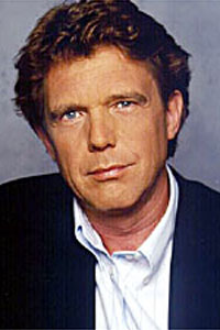 On May 10th 2007 it was announced that Dutch producer John De Mol (As shown on the right) had purchased the Hammer film rights. They began shooting a new horror/thriller film in 2008 in Ireland. In 2009 it was announced that Hammer films and ALliance films were making a remake of "The Woman in Black" scheduled for a 2011 release.
www.backfromthedead.posterous.com
Hammer Horror films were famous for making horror films in the 50's, 60's, 70's such as The Curse of Frankenstein (Peter Cushing as shown in the picture to the right as Frankenstein) and Dracula (Christopher Lee as Dracula as shown on the right). They also made Sci-Fi, Thrillers, Film Noir and Comedies. Hammer was established in 1934 and was partner with Warner Bros. William Hinds formed Hammer Productions. Hammer made most of it's money through distribution of it's films. Some of Hammer's early successes were The Curse of Frankenstein, Dracula and The Mummy.
The Curse of Frankenstein was originally a novel by Mary Shelley and was The first film in colour for Hammer films. It starred both Christopher Lee and Peter Cushing and had worldwide success which led to several sequels.
http://www.youtube.com/watch?v=_xIGil528gA
Dracula was released in 1958. It was directed by Terrance Fisher and also stars Christopher Lee and Peter Cushing.
http://www.youtube.com/watch?v=YktZAMOvZoc
Hammer was based in the UK in London. In the 1970's Hammer became less successful because horror films by other new directors were becoming more artful and subtly horrific. The studio struggled to keep it's place in the market. A main director who was causing problems for Hammer was Roman Polanski.
In 2003 the studio announced plans to work with an australian company called "Pictures in Paradise" to develop new horror films for the DVD and cinema market.
 On May 10th 2007 it was announced that Dutch producer John De Mol (As shown on the right) had purchased the Hammer film rights. They began shooting a new horror/thriller film in 2008 in Ireland. In 2009 it was announced that Hammer films and ALliance films were making a remake of "The Woman in Black" scheduled for a 2011 release.
Thursday, 4 November 2010
Kyle Cooper: Top Tips and Revolutionary Titles
From watching a 2-part interview with Kyle Cooper some of the tips I picked up were as follows:
- Don't be afraid to experiment with different things. Cooper mentioned about how he wonders what would happen if he shoots things differently for example through some broken glass.
- Don't make too much of your work digital. Cooper says how he's not completely against the idea of having digital effects but it looks better to keep as natural as possible.
- Sometimes it's best to keep it simple. Cooper says how his favorite title sequence was from "Dead Zone" (1983). I can see why this set of titles is his personal favorite as they are very simple but at the same time very effective.
Se7en Titles
First off I think the opening titles to the film "Se7en" are effective because of the effects that are used. Kyle Cooper uses an effect to show the text vibrating when the actors and actresses names come in. This makes it hard for the viewer to read which could be seen as quite strange to some viewers. Secondly I think the changes inbetween the videos and the text are interesting because they are so sudden. This might be to try and make the viewer scared because it catches you offguard. The titles occasionally have drops of blood in them. This is a warning to the viewer of what's to come and could make them aware that the film contains horror and gore. Similarly there is flashes of red which could suggest blood to the viewer. The music played in the opening titles is awkward and uncomfortable for the viewer. It doesn't really make sense musically and doesn't let the viewer feel relaxed about coming to watch this film. Throughout the opening titles there is someone with a needle sewing up a book. It looks like they're causing pain to themselves with the needle because it slowly is coming away from their finger and there is the occasional drop of blood. The opening titles are very detailed. All the recordings that are taken are close-ups of either the book that the person is sewing or of the persons hands. Overall the title sequence is very interesting and very unique.
Preliminary Exercise
Today we recorded our preliminary exercise and edited it on Final Cut. I was in a group with Amber, Ita and Sophie. Our idea was to record a job interview and I was interviewing Ita.
We learnt how to use the 180 degree rule which is when recording a conversation between two people you have to imagine there is a straight line down middle of the two people. The camera must stay on either the left or the right of the imaginary line to prevent the people looking like they've been flipped round. You start buy filming the conversation from over the shoulder of one of the two people and then film it from over the other persons shoulder.
We also learnt about Match-On-Action. We used this when we were filming Ita walking through the door into the interview room. What we did was record Ita going up to the door and opening the door handle and then went inside the room and recorded Ita walking in from inside. This way it looks like we have managed to record Ita only once but from two different angles.
Wednesday, 3 November 2010
Fears
My Fears
Some of the things I am scared of are..
Horses
Big Dogs
Heights
Voldemort
People who try to be hard and intimidating and can get away with it.
Modern Day Fears
Some of the things that people are scared of in the modern day are youths who where hoodies. This is because they are stereotyped to be violent and to carry weapons.
Film Pitch
The pitch for our film was that a class was in a college and as they go out for a break one person in particular doesn't return, at the time nothing is thought of it but gradually more and more people go missing. One girl tries to investigate what is happening when she finds the jumper of one of the people who has gone missing. When she finds it the thing that has been taking everyone tries to get this girl but she causes a big chase scene throughout most of the film until finally she gets rescued by someone at the end of the film.
Wednesday, 20 October 2010
Monday, 18 October 2010
Saturday, 16 October 2010
James Ward's Special Effects Workshop: Part 1
We had a guest come in called James Ward who does special effects masks.
We had a volunteer from the class (Alexi) to have a mask made on him and James started by putting on a bald cap over Alexi's hair and sticking down contact glue so it stayed on. The next bit was when James put a blue mixture all over Alexi's face but to make sure he could still breathe he put to pipes in his nostrils. When Alexi's face was completely covered Amber helped James put bandages on Alexi's face and sticking them down with water. After this James mixed together some powder to make it into a paste which went onto Alexi's face. Once this was done James took the mask off Alexi and passed it round the class. It surprised me that the mask was so warm. I thought it would be cold because the mixture had been mixed with water. I enjoyed it when james was talking to Alexi and because Alexi couldn't move his mouth he couldn't reply properly. I learnt to always make sure there is no air bubbles when putting on the paste because otherwise that will make lumps on the mask when you get to the finished product.
We had a volunteer from the class (Alexi) to have a mask made on him and James started by putting on a bald cap over Alexi's hair and sticking down contact glue so it stayed on. The next bit was when James put a blue mixture all over Alexi's face but to make sure he could still breathe he put to pipes in his nostrils. When Alexi's face was completely covered Amber helped James put bandages on Alexi's face and sticking them down with water. After this James mixed together some powder to make it into a paste which went onto Alexi's face. Once this was done James took the mask off Alexi and passed it round the class. It surprised me that the mask was so warm. I thought it would be cold because the mixture had been mixed with water. I enjoyed it when james was talking to Alexi and because Alexi couldn't move his mouth he couldn't reply properly. I learnt to always make sure there is no air bubbles when putting on the paste because otherwise that will make lumps on the mask when you get to the finished product.
Friday, 1 October 2010
New York Sequence
On Final Cut we did an opening credits sequence that showed New York City when it's really busy. We used Final cut and learnt about different Transitions. We learnt how to put text from Photoshop into Final Cut. We put a soundtrack to it that we had created in Garageband. I put a Jazz piece to go with the opening credits.
We did overlapping of different videos and made them fade in and fade out to make them look professional.
We did overlapping of different videos and made them fade in and fade out to make them look professional.
Logo
We created Logo's using Photoshop and Final Cut. With Photoshop we learnt how to use the brush tool and how to download brushes from the internet. I downloaded brushes that looked like Speakers for my logo. I put some multicoloured lightning bolts around the side of the speaker so it looked like it was playing music.
On final cut we had to put our logo into animation. For mine I made it so that the lightning bolts fade in and then fade out again.
It turned out like this..
On final cut we had to put our logo into animation. For mine I made it so that the lightning bolts fade in and then fade out again.
It turned out like this..
Opie style Photoshop
So I did a picture of myself on Photoshop in the style of Julian Opie (www.julianopie.com). Julian Opie is famous for doing the cover of Blurs greatest hits album.
To do this we had to use the pen tool on Photoshop which I found really difficult. The pen tool can be very hard to control and so we were taught a tip to press Alt and Click on the vector to have more control.
We were also taught the importance of using different layers. It's important to use different layers so that you can change different bits without changing the whole picture.
My Opie style Picture looked like this..
Monday, 27 September 2010
Subscribe to:
Comments (Atom)


