Friday, 8 April 2011

Evaluation Question 4


Above is a picture I put together on photoshop of all the equipment we used and websites we used. The website include Facebook for getting feedback on our video, Youtube for doing research into our genre and Blogger for posting blogs throughout the project. The equipment we used includes a Light Stand for holding up the lights at the side of the stage when recording our video, a tripod for holding the camera still for when we were recording, the HD Camera to get quality high - definition footage, the camera tape to store all the footage recorded on the camera, the lights to light the stage as we wanted it to be and the macbook for editing all the footage together to create our video.

With Final Cut Express on the Macbook we were able to edit together different pieces of footage together from the recording we did on the college stage. We managed to do different transitions to cut between different shots such as fade in and fade out. Also we were able to put Nathaniel's bass playing in slow motion in parts of the video.

The reason for the use of Facebook was so that we could create a group and invite members to give feedback on our video. This was successful as we had different people offering different opinions on the video and different ways we could improve it. Also we could post other things such as our magazine advert and our Digipaks on there so that members of the group could give feedback on those to. Although it's not on the picture I created on photoshop I also used the social networking site "Myspace" to e - mail Little Man Tate to let them know we were using there song in our music video. I had to create an account to be able to do this so you can view my page at www.myspace.com/christianjonesonline

The HD Camera and the other physical equipment we used for our video were also of great use to create our music video. At first we recorded several different shots with the HD Camera without it being on the HD setting. It was a rookie mistake so we decided to re - record the whole thing but with the camera obviously on the HD setting. The lights were really good also. We thought we would need more than two lights for the video but because we were recording each shot individually (For example recording the vocals first and then the guitar and then the bass etc.) we were able to move the lights around sufficiently. We attached the lights to the light stands so we could adjust the height of the lights to how we wanted them to be. The tripod was really useful to hold the camera still. If we didn't have a tripod to use we would have to of done hand - held shots which would mean the camera wouldn't be still whilst recording. Therefore the tripod was really useful. The macbook was also hugely important because without it we would have nothing to edit the clips together with. Also if we didn't have the macbook we wouldn't be able to use the social networking site to get the feedback from people.

I think the most important piece of equipment used that is shown above is the lights. The reason these were so useful was because we could light the video as if we were an actual band performing in a music video. The idea to have the lights the way we did came from the video of "Sorry" by a band called Life In Film.


Evaluation Question 3

We got feedback from several different sources. One of those sources was getting feedback by creating a Facebook group and posting the video on there and letting our friends comment on it. People said they really liked the opening when the camera pans up from my guitar to my face singing into the microphone. People also liked that it was in black & white and that it looked like a genuine performance. However, the main negative feedback was that there was only one angle of me singing. Also a few transactions didn't work very well.


When we asked the teachers for feedback on our video they said that it perhaps needed a few more different camera angles to make it interesting. Instead of re -filming what we did is added more footage from other shots to mix it around a bit more and have quicker cuts. This technique is used to keep the viewer interested in the video.

With the feedback we got, we decided to take it on board and use it to make our video better. The way we did that was by having more shots of us in front of the Union Jack. This made our video look more interesting and it had more of a theme that it was following. Also by doing this the video had a wider range of shots which also makes the video more interesting for the viewer to watch.

For my digipak I got feedback from the teachers saying that to make it into the comic book style I should give it quite a thick border. I did this and it has turned out to look more like a comic book than it did without. With the digipak I wanted to go for the comic book/football theme. To do this I needed people from my class to pretend they were in a football team so I could get a realistic picture for the front cover. We borrowed the school football kit and a football from the school.


Wednesday, 6 April 2011

Evaluation Question 2


On the top left of this image is the front cover for my digipack. On the top right is my advertisement poster. In the middle is Stephen playing drums. On the bottom left is Nathaniel and bottom right is myself. I think that my digipack and poster goes with the video because the theme for the digipack is football which is the kind of game that three young lads in a britpop band are into. The two pictures towards the bottom are Nathaniel in front of the British flag and myself in front of the british flag. The reason I chose these pictures to compare with my digippack and advertisement is because football is traditionally a British game and we were imitating a britpop band. Also the stereotype of britpop is the "Do It Yourself" style and you can see that.
Rather than having an obvious stylistic link, the combination has more of a cultural link. Britpop is primarily about stories of working class life told by working class musicians. To evoke this idea on the digipak I chose the whole Sunday League football imagery in the style of the comic book "Roy of The Rovers". This is a cultural combination with Britpop because it's very much a young man's game and the comic book is very much a young mans source of entertainment.


Evaluation Question 1 - Part 3

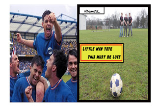
For the third part of question 1 we have to show comparisons with our digipack and other albums. For the front cover of my Digipack I have compared it with Robbie Williams' "Sing When Your Winning". The reason that my front cover is similar to Robbie Williams' is because they are both based around the football/sports theme. As you can see in mine the ball is set up ready to be taken for a free kick and in Robbie Williams' he has already won and is celebrating victory. My digipack cover is also themed around a comic book style.

On the left is the disck for the Arctic Monkeys album "Whatever People Say I Am, That's what I'm Not". On the right is the inside cover for my digipack. They are similar because my digipack relates to it's front cover because it's a football and the theme of the digipack is football. The Arctic Monkeys disk relates to the front cover of their album because on the front cover is a guy smoking and the on the disk is a picture of an ashtray.

Tuesday, 5 April 2011

Evaluation Question 1 - Part 2


Picture 1 - I chose "Headbutt" by The King Blues for my first screen shot. The reason I chose this part of the video is because at this point in the song the lead singer sings "I said to all my mates she won't make a monkey out of me" and there is a monkey sitting right next to him which a very literal relation between the lyrics and the video.

Picture 2 - For the second screen shot I chose "Single Ladies" by Beyonce. The reason I chose this video was because I think the record company would want to show that Beyonce is a sexy, beautiful woman and by putting her in this video that's how she's represented. Also she is strong and independent.

Picture 3 - For this screen shot I chose "Yeah" by Usher. The reason I chose this video was because Usher is an R&B artist and R&B artists are always quite slick and well dressed and very good at dancing like Usher is in this video.

Picture 4 - I chose "You're Gonna Lose Us" by The Cribs. The reason I chose this video is because it shows intertextual reference with the television program "The Word". On "The Word" they had performances on the stage that The Cribs were playing on for this music video. Also in the video the song is introduced by the presenter of "The Word" - Terry Christian.

Picture 5 - I chose "Grenade" by Bruno Mars for my fifth screen shot. I chose this shot because at this point in the video the camera is in a car that is driving by and in the frame is Bruno Mars pulling his piano along the street. The camera is from the point of view of someone driving the car.

Picture 6 - I chose "Empire State of Mind" by Jay - Z and Alicia Keys for my sixth screen shot. I chose this shot because the lighting is a simple spotlight on Jay - Z in the middle of performing. It's a really good shot because the viewer can only see the silhouette of Jay - Z and the audience behind him.

Picture 7 - For the seventh screen shot I chose "Runaway" by Devlin and Yasmin. I chose this particular screen shot from the video because the Mis - en - Scene is Devlin standing in a council estate rapping. He is wearing a shirt buttoned up all the way which is the kind of the thing he would wear being a young lad. 

Picture 8 - For the eighth screen shot I used the video that was the main influence on our music video. "Sorry" by Life In Film. I chose this particular shot because it is very similar to the side angle shot of myself singing into the microphone.

Picture 9 - For the ninth screen shot I chose "Supersonic" by Oasis. I chose this because the video is in Black and White like ours. Also Oasis were one of the main influences for us because we chose to do a Britpop song for our music video. 

Evaluation Question 1 - Part 1

Picture 1 - For this image we had to choose a shot that showed a relation between the lyrics and/or music with our video. I chose two screen shots that I think do that. The shots I chose cut between each other during the bridge in the song. The lyrics for the bridge are as if the lead singer is having an argument with his girlfriend so we thought it would be a good idea to have the video swapping between myself and Nathaniel to look as though we were having the argument.

Picture 2 - For this image I chose a shot of Nathaniel playing bass with his hair covering his face and the camera at low angle looking up. The reason I chose this shot is because I think a record company would want the artist to be represented as four young lads just picking up guitars and playing almost anything so with Nathaniel having his hair covering his face it makes it look a bit scruffy which is the kind of representation I think a record company would want to give from this particular song. AUTHENTICITY

Picture 3 - This shot I chose because I think it demonstrates our music genre (britpop) by showing myself simply performing in front of a microphone. Quite often britpop music videos have just the band performing on stage similar to our video. For example, the main influence for our style of video which was by a band called Life In Film and the video was for a song called "Sorry".


Picture 4 - For this shot the intertextual reference comes from "Sorry" by Life In Film. At the beginning of their video they have a very similar shot to the one I chose for my 4th key frame. This is also similar to the famous britpop band, The Smiths who have pretty much all of their album covers in black and white. I have referred to The Smiths because our video and the Life In Film video are both in black and white. The Smiths often referenced Kitchen Sink Dramas from the sixties that told stories of working class life - much like the song we chose. These sixties films such as Billy Liar and Saturday Night Sunday Morning used a naturalistic black and white style, something that our video also uses.

This is an example of one of The Smiths album covers

Picture 5 - I chose this shot for the fifth key frame because I needed to demonstrate the use of camerawork. This shot demonstrates the use of how we used the camera because for this particular shot we just had the camera zoomed in on the guitar. This is similar to Blurs "Song 2" when they zoom in on Graham Coxon playing his guitar.


Picture 6 - For the sixth key frame I chose a similar shot as the one I chose for the third shot. The reason for this was because you can see that only part of my face is lit up. This demonstrates the way we chose to have the lighting. We didn't want the stage to be to bright because we wanted it to be similar to other videos we had seen. What we did was put one light on the side of the stage and another light on the other side so that my face was lit up only from one side. Again this is similar to the video for "Sorry" by Life In Film.

Picture 7 - I chose the shot of myself in front of the Union Jack for the seventh shot because the Union Jack was a huge part of our Mis - en - Scene. Alex painted a Union Jack on to an old bed sheet which was in a britpop style because a big part of britpop is the whole "Do it Yourself" element. The reason we chose to paint a Union Jack is simply because we were making a video as if we were a britpop band and therefore wanted to have the British flag. This is a major part of Britpop as it was a symbol used very heavily in the sixties Mod culture, which is was precursor to the Britpop scene. Rather than having any right wing connotations, it is more to do with patriotism and cultural pride.

Picture 8 - I think the eighth picture shows that we have watched other music videos because in alot the picture is of myself playing my guitar. This shows that we have watched other music videos because in most britpop videos they will have the actual band playing and not actors acting out a story. There is an emphasis on a 'live' performance in order to create the idea of authenticity in terms of the band - this is a group that creates their own music, there is nothing fabricated or manufactured.

Picture 9 - Similar to the eighth picture. I chose this picture again because it shows Nathaniel playing his bass guitar. This is like alot of other britpop videos where they actually show the band playing there instruments instead of actors and actresses acting out a story.


The Cribs - Mens Needs. In this video The Cribs are also playing their instruments like alot of other Britpop music videos.